
qgraphは、ネットワークとしてデータを視覚化するために使用することができ、加重グラフィカルモデルを視覚化するためのインタフェースを提供しているパッケージです。
リファレンスマニュアルには、関数のサンプルコードのみで出力されたグラフがありません。そこで、qgraphのサンプルコードと合わせてグラフを並べてみました。
リファレンスマニュアルには、関数のサンプルコードのみで出力されたグラフがありません。そこで、qgraphのサンプルコードと合わせてグラフを並べてみました。
qgraph
library(qgraph)
## Not run:
### Correlations ###
# Load big5 dataset:
data(big5)
data(big5groups)
# Compute correlation matrix:
big5_cors <- cor_auto(big5, detectOrdinal = FALSE)
# Correlations:
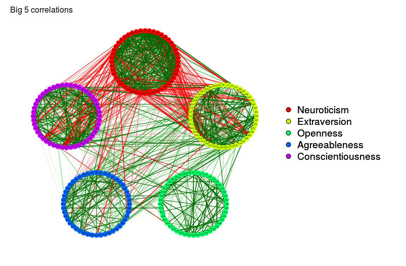
big5Graph <- qgraph(
cor(big5),
minimum = 0.25,
groups = big5groups,
legend = TRUE,
borders = FALSE,
title = "Big 5 correlations"
)
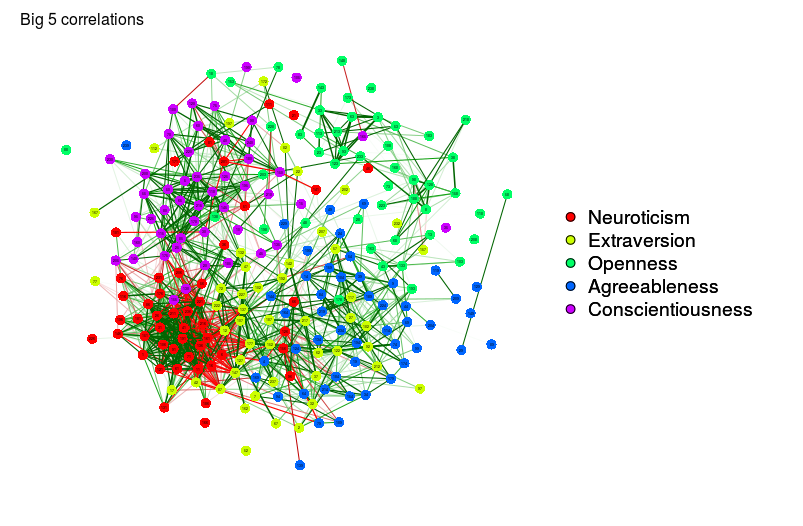
# Same graph with spring layout:
qgraph(big5Graph, layout = "spring")
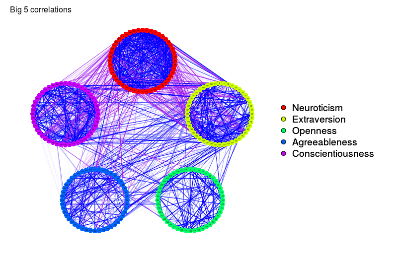
# Same graph with different color scheme:
qgraph(big5Graph, posCol = "blue", negCol = "purple")
### Network analysis ###
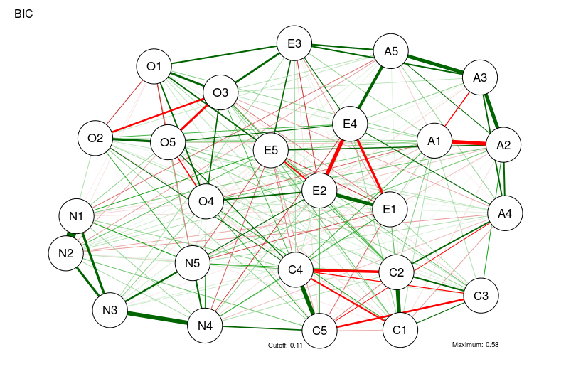
### Using bfi dataset from psych ###
library("psych")
data(bfi)
# Compute correlations:
CorMat <- cor_auto(bfi[, 1:25])
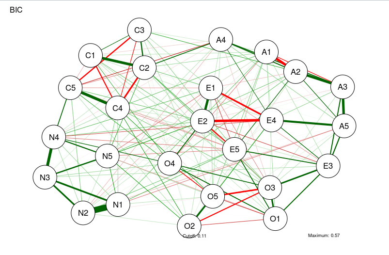
# Compute graph with tuning = 0 (BIC):
BICgraph <- qgraph(
CorMat,
graph = "glasso",
sampleSize = nrow(bfi),
tuning = 0,
layout = "spring",
title = "BIC",
details = TRUE
)
# Compute graph with tuning = 0.5 (EBIC)
EBICgraph <-
  qgraph(
    CorMat,
    graph = "glasso",
    sampleSize = nrow(bfi),
    tuning = 0.5,
    layout = "spring",
    title = "BIC",
    details = TRUE
  )
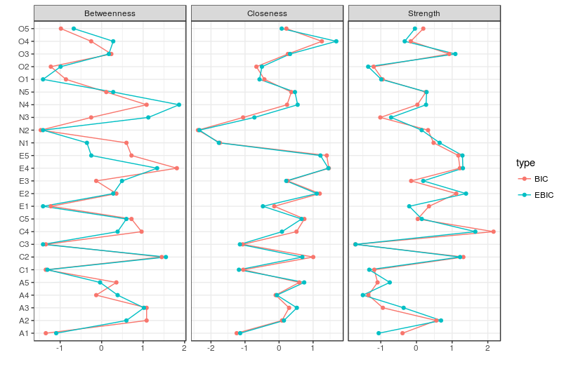
# Compare centrality and clustering:
centralityPlot(list(BIC = BICgraph, EBIC = EBICgraph))
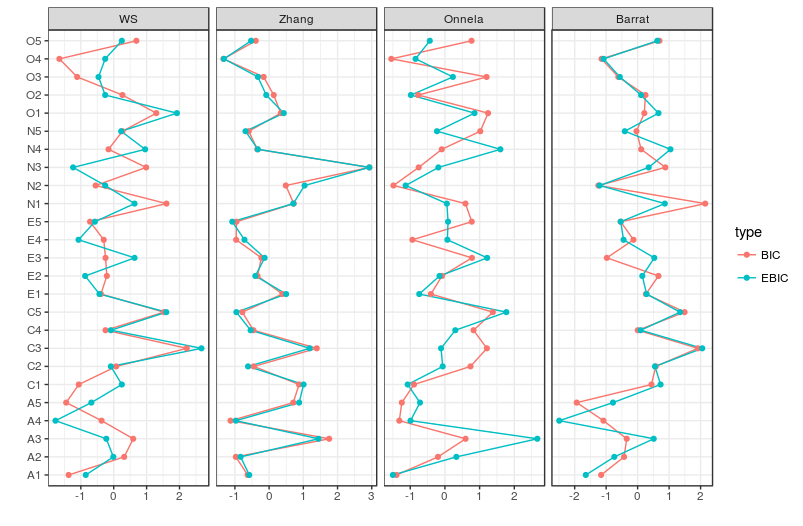
clusteringPlot(list(BIC = BICgraph, EBIC = EBICgraph))
# Compute centrality and clustering:
centrality_auto(BICgraph)
clustcoef_auto(BICgraph)
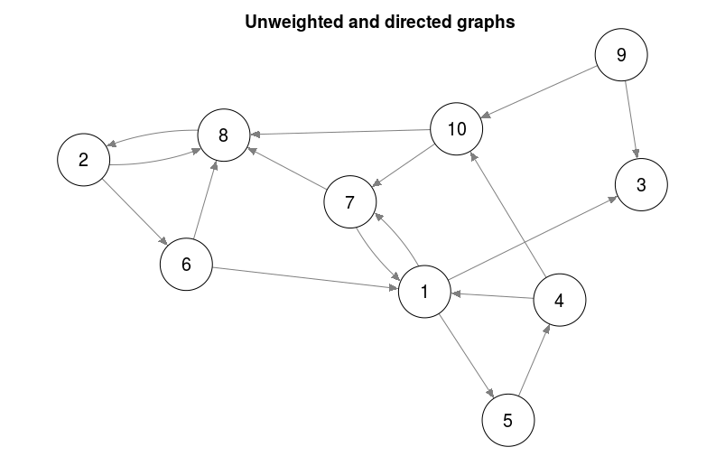
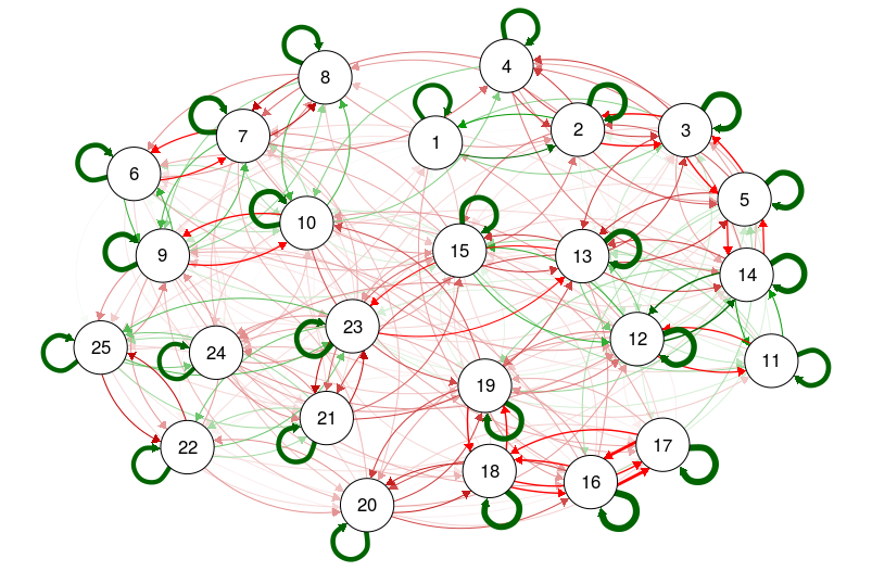
### Directed unweighted graphs ###
set.seed(1)
adj = matrix(sample(0:1, 10 ^ 2, TRUE, prob = c(0.8, 0.2)),
             nrow = 10,
             ncol = 10)
qgraph(adj)
title("Unweighted and directed graphs", line = 2.5)
# Save plot to nonsquare pdf file:
qgraph(adj,
       filetype = 'pdf',
       height = 5,
       width = 10)
#### EXAMPLES FOR EDGES UNDER DIFFERENT ARGUMENTS ###
# Create edgelist:
dat.3 <- matrix(c(1:15 * 2 - 1, 1:15 * 2) , , 2)
dat.3 <- cbind(dat.3, round(seq(-0.7, 0.7, length = 15), 1))
# Create grid layout:
L.3 <- matrix(1:30, nrow = 2)
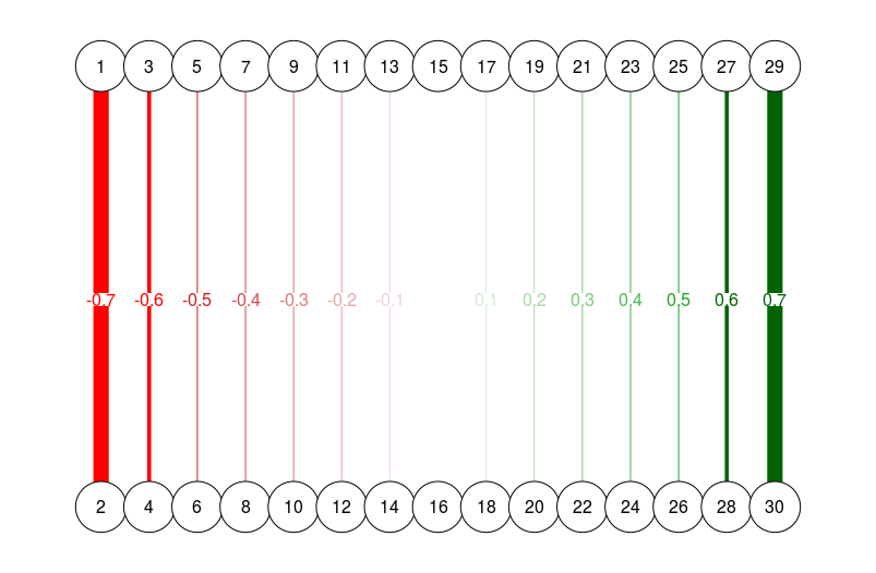
# Different esize:
qgraph(
dat.3,
layout = L.3,
directed = FALSE,
edge.labels = TRUE,
esize = 14
)
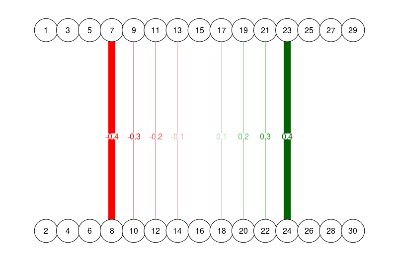
# Different esize, strongest edges omitted (note how 0.4 edge is now
# just as wide as 0.7 edge in previous graph):
qgraph(
  dat.3[-c(1:3, 13:15), ],
  layout = L.3,
  nNodes = 30,
  directed = FALSE,
  edge.labels = TRUE,
  esize = 14
)
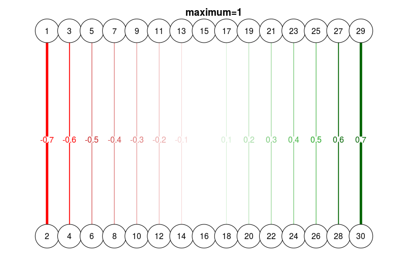
# Different esize, with maximum:
qgraph(
  dat.3,
  layout = L.3,
  directed = FALSE,
  edge.labels = TRUE,
  esize = 14,
  maximum = 1
)
title("maximum=1", line = 2.5)
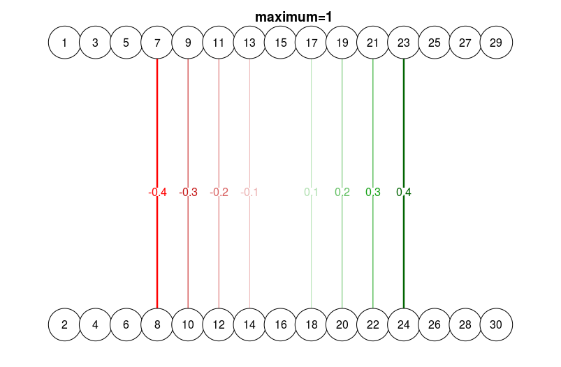
qgraph(
  dat.3[-c(1:3, 13:15), ],
  layout = L.3,
  nNodes = 30,
  directed = FALSE,
  edge.labels = TRUE,
  esize = 14,
  maximum = 1
)
title("maximum=1", line = 2.5)
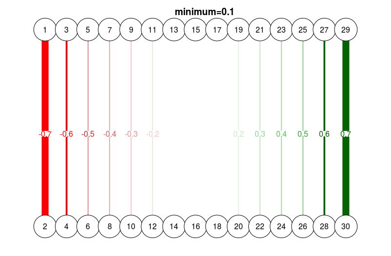
# Different minimum
qgraph(
  dat.3,
  layout = L.3,
  directed = FALSE,
  edge.labels = TRUE,
  esize = 14,
  minimum = 0.1
)
title("minimum=0.1", line = 2.5)
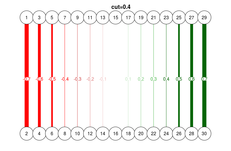
# With cutoff score:
qgraph(
  dat.3,
  layout = L.3,
  directed = FALSE,
  edge.labels = TRUE,
  esize = 14,
  cut = 0.4
)
title("cut=0.4", line = 2.5)
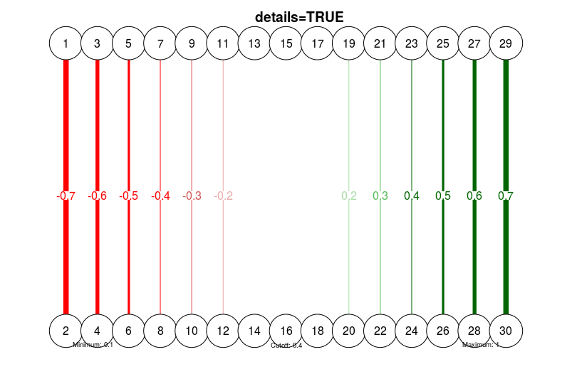
# With details:
qgraph(
  dat.3,
  layout = L.3,
  directed = FALSE,
  edge.labels = TRUE,
  esize = 14,
  minimum = 0.1,
  maximum = 1,
  cut = 0.4,
  details = TRUE
)
title("details=TRUE", line = 2.5)
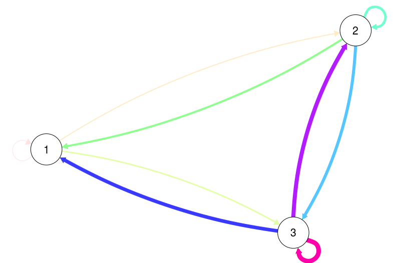
# Trivial example of manually specifying edge color and widths:
E <-
  as.matrix(data.frame(
    from = rep(1:3, each = 3),
    to = rep(1:3, 3),
    width = 1:9
  ))
qgraph(E, mode = "direct", edge.color = rainbow(9))
### Input based on other R objects ###
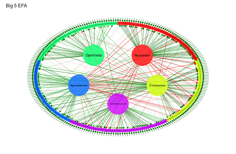
## Exploratory factor analysis:
big5efa <-
factanal(big5,
factors = 5,
rotation = "promax",
scores = "regression")
qgraph(
big5efa,
groups = big5groups,
layout = "circle",
minimum = 0.2,
cut = 0.4,
vsize = c(1.5, 10),
borders = FALSE,
vTrans = 200,
title = "Big 5 EFA"
)
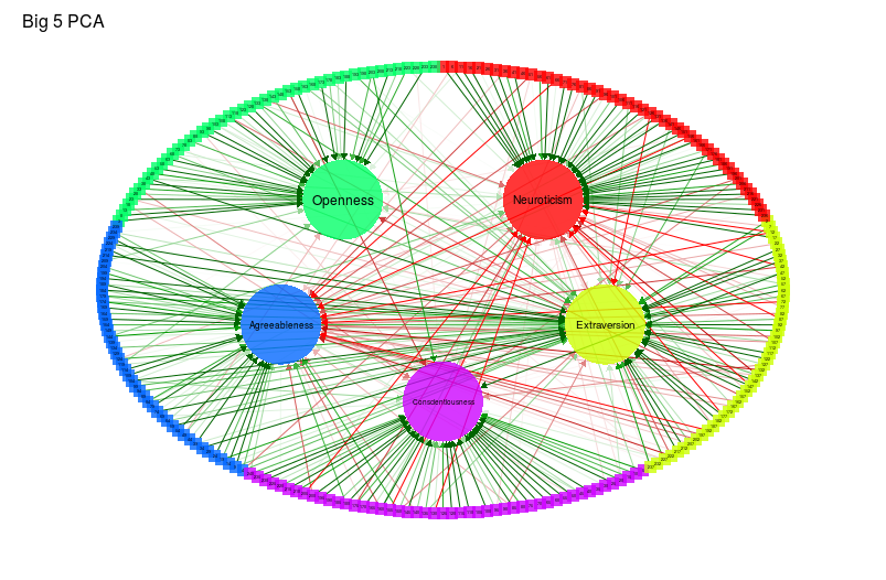
## Principal component analysis:
library("psych")
big5pca <- principal(cor(big5), 5, rotate = "promax")
qgraph(
  big5pca,
  groups = big5groups,
  layout = "circle",
  rotation = "promax",
  minimum = 0.2,
  cut = 0.4,
  vsize = c(1.5, 10),
  borders = FALSE,
  vTrans = 200,
  title = "Big 5 PCA"
)
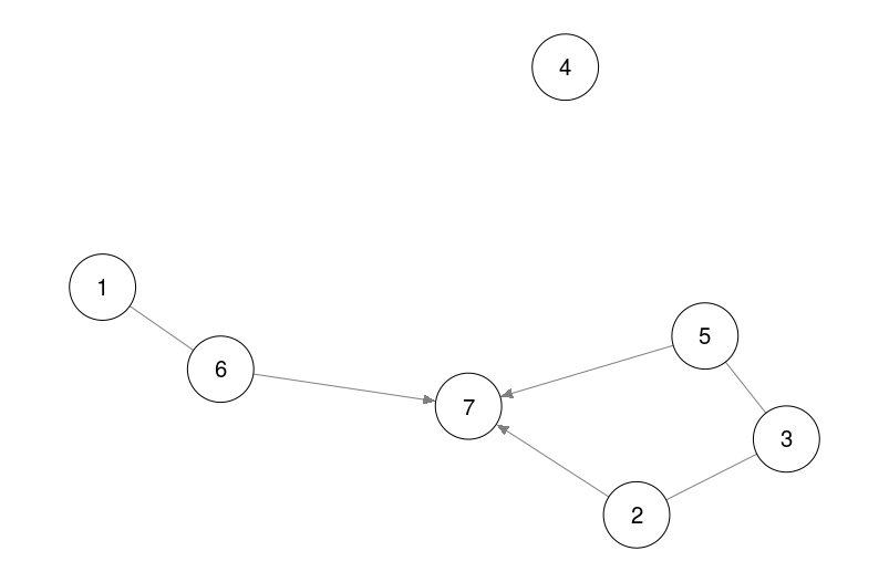
## pcalg
# Example from pcalg vignette:
library("pcalg")
data(gmI)
suffStat <- list(C = cor(gmI$x), n = nrow(gmI$x))
pc.fit <- pc(suffStat,
             indepTest = gaussCItest,
             p = ncol(gmI$x),
             alpha = 0.01)
qgraph(pc.fit)
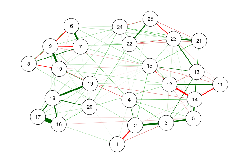
## glasso:
# Using bfi dataset from psych:
library("psych")
data(bfi)
cor_bfi <- cor_auto(bfi[, 1:25])
# Run qgraph:
library("glasso")
bfi_glasso <- glasso(cor_bfi, 0.1)
# Plot:
qgraph(bfi_glasso, layout = "spring")
## Huge (glasso):
library("huge")
bfi_huge <- huge(huge.npn(bfi[, 1:25]), method = "glasso")
# Manual select and plot:
sel <- huge.select(bfi_huge)
qgraph(sel$opt.icov, layout = "spring")
## End(Not run)
qgraph.animate
qgraph.animate関数は、gifや動画で出力する関数ではありません。成長するネットワークに基づいたアニメーションの作成を容易にするために、画像を連続して出力する関数になります。ここでは、animationパッケージのsaveVideo関数を使用して、動画にまとめたものをお見せします。
## Not run:
## For these examples, first generate a scale free network using preferential attachment:
# Number of nodes:
n <- 100
# Empty vector with Degrees:
Degs <- rep(0, n)
# Empty Edgelist:
E <- matrix(NA, n - 1, 2)
# Add and connect nodes 1 and 2:
E[1,] <- 1:2
Degs[1:2] <- 1
# For each node, add it with probability proportional to degree:
for (i in 2:(n - 1))
{
  E[i, 2] <- i + 1
  con <- sample(1:i, 1, prob = Degs[1:i] / sum(Degs[1:i]), i)
  Degs[c(con, i + 1)] <- Degs[c(con, i + 1)] + 1
  E[i, 1] <- con
}
# Because this is an edgelist we need a function to convert this to an adjacency matrix:
E2adj <- function(E, n)
{
  adj <- matrix(0, n, n)
  for (i in 1:nrow(E))
  {
    adj[E[i, 1], E[i, 2]] <- 1
  }
  adj <- adj + t(adj)
  return(adj)
}
### EXAMPLE 1: Animation of construction algorithm: ###
adjs <- lapply(1:nrow(E), function(i)
  E2adj(E[1:i, , drop = FALSE], n))
qgraph.animate(
  adjs,
  color = "black",
  labels = FALSE,
  sleep = 0.1,
  smooth = FALSE
)
rm(adjs)
### EXAMPLE 2: Add nodes by final degree: ###
adj <- E2adj(E, n)
qgraph.animate(
  E2adj(E, n),
  color = "black",
  labels = FALSE,
  constraint = 100,
  sleep = 0.1
)
### EXAMPLE 3: Changing edge weights: ###
adjW <- adj * rnorm(n ^ 2)
adjW <- (adjW + t(adjW)) / 2
adjs <- list(adjW)
for (i in 2:100)
{
  adjW <- adj * rnorm(n ^ 2)
  adjW <- (adjW + t(adjW)) / 2
  adjs[[i]] <- adjs[[i - 1]] + adjW
}
qgraph.animate(
  adjs,
  color = "black",
  labels = FALSE,
  constraint = 100,
  sleep = 0.1
)
## End(Not run)